RE- Spatial-temporal and content analysis of Twitter Data
Replication of:
Spatial, temporal and content analysis of Twitter data
Original study by Wang, Z., X. Ye, and M. H. Tsou. 2016. Spatial, temporal, and content analysis of Twitter for wildfire hazards. Natural Hazards 83 (1):523–540. DOI:10.1007/s11069-016-2329-6. and First replication study by Holler, J. 2021 (in preparation). Hurricane Dorian vs Sharpie Pen: an empirical test of social amplification of risk on social media.
Replication Author: Maddie Tango
Replication Materials Available at: https://github.com/mtango99/RE-Dorian
Created: 05 May 2020
Revised: 25 May 2020
Abstract
Why study the spatial distribution of Twitter data?
Wang et al. (2016) analyzed Twitter data for wildfires in California, finding that the social media data can track wildfires over space and time, and showed that news media and local authority were dominant in the wildfire retweet network.
Holler (2021) is studying Twitter data for Hurricane Dorian on the Atlantic coast, finding that in spite of tending news and social media content regarding a false narrative of risk, original tweets still clustered significantly along the real hurricane track, and only along the hurricane track.
Reproducing and replicating spatial research of Wang et al. (2016) and Holler (2021) is important for understanding how we may analyze large datasets such as Twitter tweets and retweets, using keywords and R packages for visualization.
In this replication study, I will study the spatial and temporal distribution of tweets with the words “tornado,” “tornado warning,” and “debris” 500 miles from Alabama coordinates (32,-87) between April 27 - May 5, 2021.
Original Study Information
*all figures cited in this section can be found in Wang et al. (2016)
Wang et al. (2016) analyzed the spatial and temporal patterns of wildfire-related tweets between May 13, 2014 and May 22, 2014 using the Twitter search API.
First, Wang et al. (2016) selected for tweets and retweets with the words “fire” or “wildfire.” These tweets could be analyzed based on space, time, content, and network. They mapped the locations of the tweets using centroids of each census block to normalize by population (Figure 3). They also graphed the frequency of tweets over time, and the frequency of the top 10 terms used (Figure 1, Figure 7).
Wang et al. then did a second search, searching by specific wildlife (San Marcos and Bernardo), and filtering out tweets and retweets without the words “fire” or “wildfire” after. This was used to identify ignition locations of the fires so that they could then analyze the influence of distance from the ignition site on Tweet responses. They removed URLs and stop words (words with little meaning), and combined words that meant the same thing. They created a map for each fire, using a dual kernel density estimation (Dual KDE) and again normalizing by census block population (Figure 4, Figure 5). They also graphed the frequency of tweets over time (Figure 2).
They then created a figure of the retweet network using the “k-means clustering method” with the R package “igraph” and published term clusters in the form of a table for “wildfire” tweets (Figure 10, Table 3). This network analysis helped to determine information gatekeepers, using the indegree (times they’ve been retweeted by others) and outdegree (times they have retweeted others) for each node (user).
Holler (2021) loosely replicated the methods of Wang et al (2016) for the case of Hurricane Dorian’s landfall on the U.S. mainland during the 2019 Atlantic Hurricane season. Data was based on Twitter Search API queries.
Holler modified Wang et al.’s methods by not searching for retweets for network analysis, focusing instead on original Tweet content with keywords hurricane,
Dorian, or sharpiegate (a trending hashtag referring to the storm). Holler used a buffer size of 1000 mi of coordinates (32,-78) off the coast of South Carolina and used
data from September 3-11, 2019.
Holler modified the methodology for normalizing tweet data by creating a normalized Tweet
difference index and extended the methodology to test for spatial cluserting with the local Getis-Ord statistic. The study tested a hypothesis that false narratives
of hurricane risk promulgated at the highest levels of the United States government would significantly distort the geographic distribution of Twitter activity related
to the hurricane and its impacts, finding that original Twitter data still clustered only in the affected areas of the Atlantic coast in spite of false narratives about
risk of a westward track through Alabama.
Wang et al. (2016) conducted their study using the tm and igraph packages in R 3.1.2 but did not state if any other software were used.
The replication study by Holler (2021) used R, including the rtweet, rehydratoR, igraph, sf, and spdep packages for analysis.
Materials and Procedure
I used the code provided by Holler (2021) and changed the Twitter search parameters to the words “tornado,” “tornado warning,” and “debris” within 500 mi of Alabama coordinates (32,-87). Data were downloaded on May 5, 2021 and thus included tweets from between April 27 - May 5, 2021. 8452 results came up out of a total dataset for that area. Of these 8452 tweets, only 752 had GPS coordinates. I will refer to these 752 tweets as “filtered tweets.” Without specified keywords, 8914 tweets were found for these search parameters, with coordinates. The search IDs for the tweets with the keywords can be found here, and search IDs for the tweets without specifying keywords can be found here.
Tweets were normalized based on population per county; the tidycensus package was used to draw county populations from the US Census.
A “normalized difference tweet index” (ndti) as developed by Holler (2021) was used to gauge how many tweets were about the tornadoes in relation to baseline tweet activity.
The three sets of code used for this analysis can be found here, here, and here.
Replication Results
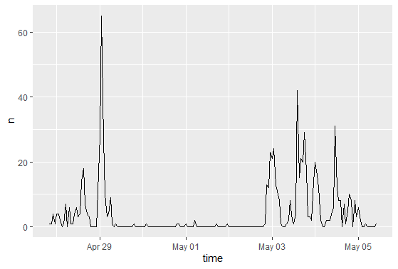
Figure 1. Temporal analysis graph. Graphs frequency of filtered tweets with keywords over time. There was a large spike in tweets with keywords “tornado,” “tornado warning,” and “debris” on April 29, then very few tweets until May 3-May 5, when tweets were more common.
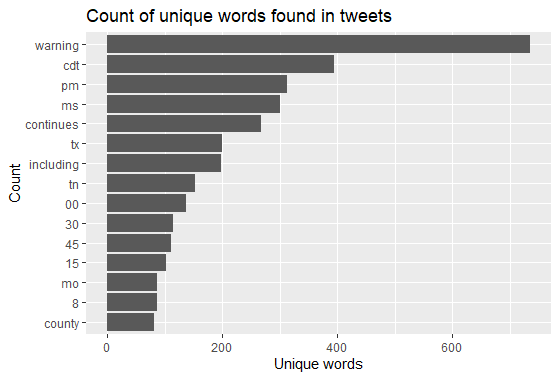
Figure 2. Tweet word content frequency graph. Words do not include “stop words” (words like “the” and “and” with no relevant meaning) or the keywords used in the search. It makes sense that “warning” had the most given I used keywords “tornado” and “tornado warning,” but not “warning.” Time-related words (cdt, pm, tn, 00, 15, 30, 45) and location-related words (states abbreviations like ms, tx, and county) were most common.
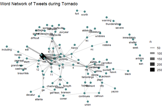
Figure 3. Tweet word pairs. Shows a network analysis of filtered tweets based on their relationship in the tweet/retweet network. Time-related and location-related words are most clumped, with many numbers and county names.
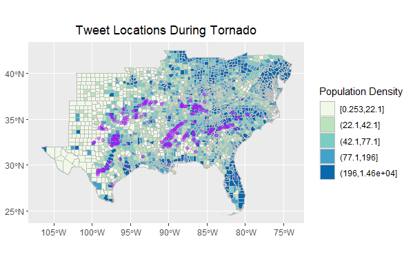
Figure 4. Tweet locations map. Shows filtered tweets (500 mi from (32,-87) coordinates). Tweets track tornado activity.
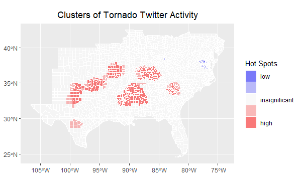
Figure 5. Hotspots map. Created using an Ord G* statistic. Tweets track tornado activity.
Unplanned Deviations from the Protocol
For the filtered tweet network (Figure 3), I changed “n” from 25 to 6 so that more word pairs would show up. Other than that, I followed Joe Holler’s scripts, which itself deviated a bit from the Wang et al. (2016) methodology given only one API search was conducted (as opposed to 2 for Wang et al. (2016)). We used the same data to track the locations of the tornadoes and analyze spatially as well.
Discussion
Tweet word content frequency (Figure 2) and tweet word pairs (Figure 3) show a strong relationship between tornado-related tweets and words having to do with location and time. My findings confirm patterns observed by Wang et al. (2016), that tweets can characterize a natural disaster over space and time. Particularly for this analysis, where I only used tweets with GPS coordinates, it makes sense that those more connected to the natural disaster would feel more comfortable with sharing GPS coordinates, though perhaps out of necessity. Holler (2021) found similar results, that tweets tracked Hurricane Dorian over space.
It is difficult to extrapolate from the maps created in this analysis the association between time and space; for example, the tweet locations and hotspots maps do not show if there is one tornado moving across space over time, if there are multiple tornadoes at the same time, or if there are multiple tornadoes at different times. However, news sources and outside research help to clarify this uncertainty. While there are not many articles about these tornadoes, there is a news article describing a tornado with hail as big as softballs in San Antonio, Texas on April 28th and a Wikipedia article that describes the tornado outbreak between May 2-4. These are times when tweet frequency increased (Figure 1). San Antonio can be seen on in both the tweet locations map (Figure 4) and the hotspots map (Figure 5).
The tornado outbreak of May 2-4, 2021 is described to be many tornadoes at the same time; 85 (mostly weak) tornadoes were confirmed in this time period in the Southeastern United States and Central Plains. The tornadoes began in Mississippi on May 2, and Nebraska, Georgia, South Carolina, West Virginia, and Texas were also hit. These areas generally line up with with tornado-related tweet activity. Texas was therefore hit both times– on April 28th and then during the May 2-4 tornadoes. Given the tornadoes were relatively weak, it makes sense that Twitter activity would line up with landfall of the tornadoes, versus in cases of more extreme natural disasters, there tends to be a lull in Twitter activity during the disaster itself due to a lack of access to electricity or due to other more pressing matters related to survival.
Future analyses should add average dates to hotspots in maps to help better understand temporal-spatial relationships so that researchers are able to rely less on Google searches and more on the data itself (even though Google searches are helpful for context).
While my sample size is decently large– 752 tweets in a 500 mi radius– it may not be a representative sample given it only includes tweets with GPS coordinates. It also does not include the full extent of the tornado outbreak given its spatial extent, although it includes most states that experienced tornadoes in that timeframe. Holler’s Dorian analysis includes a larger radius (1000 mi instead of 500 mi) and thus more tweets, during a more severe natural disaster. The maps produced by Holler’s analysis have much more clear patterns; for example, there is much clearer difference in high and low hotspots (high on the east coast and low inland). My hotspot map did not produce many areas with low hotspots. It is unclear why there was such a large difference in area with low hotspots between my analysis and Holler’s, but it may have to do with sample size. However, given tornado activity tracks tornado-related Twitter activity in my study, I have confidence in my sample and analysis.
Conclusion
While using tweet data can have ethical implications due to privacy concerns (Crawford & Finn 2014), it can also be useful for better understanding how the general public views and experiences news, natural disasters, and any other trending topics on Twitter. Future studies should consider best practices for using personal data to protect sensitive information published during situations of survival.
References
Crawford, K., and M. Finn. 2014. The limits of crisis data: analytical and ethical challenges of using social and mobile data to understand disasters. GeoJournal 80 (4):491–502. DOI:10.1007/s10708-014-9597-z
Report Template References & License
This template was developed by Peter Kedron and Joseph Holler with funding support from HEGS-2049837. This template is an adaptation of the ReScience Article Template Developed by N.P Rougier, released under a GPL version 3 license and available here: https://github.com/ReScience/template. Copyright © Nicolas Rougier and coauthors. It also draws inspiration from the pre-registration protocol of the Open Science Framework and the replication studies of Camerer et al. (2016, 2018). See https://osf.io/pfdyw/ and https://osf.io/bzm54/
Camerer, C. F., A. Dreber, E. Forsell, T.-H. Ho, J. Huber, M. Johannesson, M. Kirchler, J. Almenberg, A. Altmejd, T. Chan, E. Heikensten, F. Holzmeister, T. Imai, S. Isaksson, G. Nave, T. Pfeiffer, M. Razen, and H. Wu. 2016. Evaluating replicability of laboratory experiments in economics. Science 351 (6280):1433–1436. https://www.sciencemag.org/lookup/doi/10.1126/science.aaf0918.
Camerer, C. F., A. Dreber, F. Holzmeister, T.-H. Ho, J. Huber, M. Johannesson, M. Kirchler, G. Nave, B. A. Nosek, T. Pfeiffer, A. Altmejd, N. Buttrick, T. Chan, Y. Chen, E. Forsell, A. Gampa, E. Heikensten, L. Hummer, T. Imai, S. Isaksson, D. Manfredi, J. Rose, E.-J. Wagenmakers, and H. Wu. 2018. Evaluating the replicability of social science experiments in Nature and Science between 2010 and 2015. Nature Human Behaviour 2 (9):637–644. http://www.nature.com/articles/s41562-018-0399-z.